
Visual Percentages with Pie Charts
I ran across an interesting technique the other day that seemed worth sharing.
You are most likely familiar with sparklines which are somewhat uncommonly used to give graphical context to numerical data. I think the only place I’ve seen them in “the real world” was on a random page of a stock website.
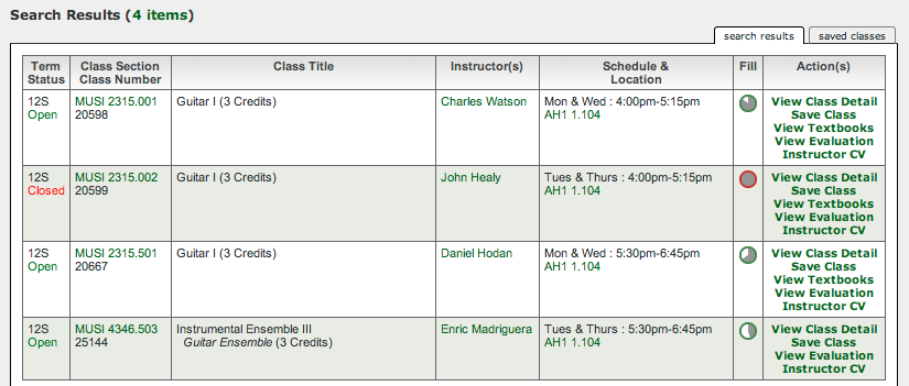
I was surprised to see these little pie charts on a course registration page, and feel it fills a very similar role. Usually you might show a horizontal “fill bar” or slider showing a percent from 0-100 but you don’t always have the luxury of space to show a wide graph in a size that gives useful information.
Assuming you are willing to spend ~30 pixels of width and height for a small pie chart (assuming ~16 px letter height and ~2 lines), you can very easily run an approximate precision calculation of what you can visually communicate to your users.
Assume that you only use the 30px up and down on the left and right sides, that’s 60px of precision, which gets you within a 2% visual estimate immediately not even including any left-right resolution. Compare that to a 60px wide fill-bar and you can see immediately how much of an advantage pie charts have.
I can immediately imagine several uses for this pie-chart display.
- Showing any type of percentage / remaining
- Showing relative size between many different things (ie: 1.0 => 0.0 scaled / long-tail)
- Visually showing a percentage or setting, onhover showing a slider to allow edits
- On a touch interface, same “click to set => slider”, almost like a knob
In cases where horizontal space is at a premium, but approximated information needs to be conveyed rapidly, or as “modal” between compact display and editing these are a great tool to have in your toolbox.
11:26 CST | category / entries
permanent link | comments?